Centennial State
Political Geography
Let's take a comprehensive look at the divergent political geography of Colorado and its effect on the 2020 Senate race...
Colorado has been considered purple since the 90’s, but has been steadily turning blue in recent years. So why is the upcoming Senate race between incumbent Republican Senator Cory Gardner and his hypothetical Democratic opponent still something the citizenry should pay attention to? For starters, the Senate is an unfair playing field, so we should care about every race. The way Senators are apportioned provides disproportionate power to citizens of certain states, even more so than the electoral college, so every seat is important. But perhaps a more interesting reason is that the divergent political geography of the Centennial State makes the potential outcome of this race much foggier. In order to illustrate this, I set out to map the behavior of political partisanship throughout the state of Colorado.
Mapping partisanship by county is actually pretty simple considering that county outlines are readily available from the US Census Bureau. However, different parts of the county take part in different races. For instance, Douglas County votes in both the 4th and 6th congressional districts. Grouping these voters into one statistic would create an apples to oranges comparison in that the 58,000 DougCo voters that voted in the 6th congressional district faced a different choice than the 117,000 that voted in the 4th congressional district. Furthermore, counties can be rather large (Douglas County is 840 mi2) so the partisan characteristics of one end of the county could be very different from the other.
On the other hand, individual voting precincts are much smaller in area and all voters in each precinct vote in the same races, providing a fair comparison across the board. However, the actual mapping of these results is rather difficult for multiple reasons. Precincts are drawn by each respective county, so you have to go to each of the 64 county clerk offices to find the outlines of the precincts they preside over. In the easiest cases, GIS shapefiles are readily available for download on their website. In the more difficult cases, hand drawn maps need to be manually converted to shapefiles using WebPlotDigitizer and multiple Python modules. In the worst cases, the county clerk doesn’t have an email address and won’t return your phone calls. As a result, I wouldn’t recommend using the following maps in any sort of official capacity to identify which precinct you vote in, but I do think these maps are pretty unique and comprehensive.
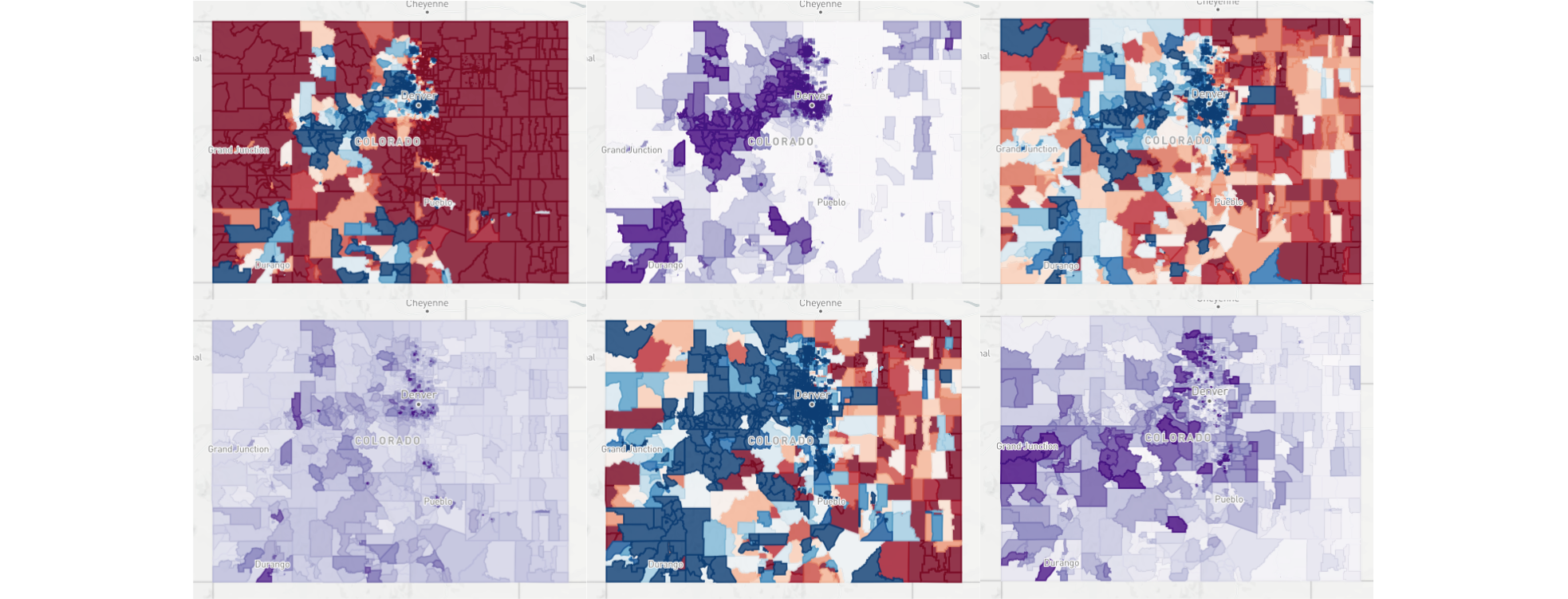
To define the scope of the analysis shown here, let’s consider results from presidential and midterm elections in the state of Colorado between 2012 and 2018. As a disclaimer, the metrics I’ll be using are similar (if not identical) to those used by analysts at FiveThirtyEight. There’s no way I’m smart enough to have invented these metrics, just smart enough to know how to apply them. Starting with the basics, partisan lean is a fairly standard metric of whether an area is more Republican or Democratic, but we will define it explicitly as
\[L_i = \frac{1}{N_i} \sum_{j=1}^{N_i} (D_{i,j} - R_{i,j}).\]where \(i\) is the precinct index, \(N_{i}\) is the number of races in the precinct, \(j\) is the election index (e.g. 2018 District 3 State House race, 2014 Senate race, etc.), and \(D_{i,j}\) and \(R_{i,j}\) are the percentage of Democratic and Republican votes, respectively, for race \(j\) in precinct \(i\). The map below illustrates this metric for each precinct throughout the state in the form of a heat map with darker shades of red representing more Republican areas and darker shades of blue representing more Democratic areas. The general trends are not surprising in that more densely populated areas (e.g. Denver, Boulder, Fort Collins) tend to be more Democratic and more sparse rural areas (e.g. the entire eastern third of the state) tend to be more Republican, but seeing where the exact lines are drawn is both interesting and informative.
However, these partisan predilections do not remain static over time. Precinct leans can easily change based on both the impact of current events and the changing makeup of voting populations. For instance, the 2018 midterms in Colorado saw an 8.1% increase in voter turnout compared to 2014. Numerous things changed in those four years, but the most obvious and earth-shattering one in terms of politics was the election of our current president. To illustrate its effect on voters’ behaviors, we’ll use what I’m calling the Trump effect: it calculates the lean of a precinct using only races from the 2018 midterms and subtracts the lean of the same precinct using only the 2014 midterms. This isolates where voters are trending due to the instability and antics of the current resident of the White House. As you can see in the map below, the sea of cerulean is not good news for Cory Gardner, especially considering he votes in line with Trump 90% of the time.
Another interesting and lesser-known metric is partisan elasticity, an index of how stubborn voters are with their partisanship, i.e. are they voting party lines down the ballot or will they vote for the other party if the right candidate comes along. This will be defined as the standard deviation of the partisan lean, or using the same variables from the first equation,
\[E_i = \sqrt{\frac{1}{N_i} \sum_{j=1}^{N_i} (D_{i,j} - R_{i,j})^2 - L_i^2}.\]In isolation, the relevance of a precinct’s elasticity is kind of hard to grasp, but when put in context with its associated lean, elasticity teases out valuable insight for potential candidates. Let’s say a campaign wanted to identify areas where a candidate’s effort would have the most impact. To do this, we can look at “flippable” precincts, precincts that have elasticities larger than the magnitude of their lean. To get the most bang for our buck, let’s also limit the scope to precincts with voter densities higher than 100 per square mile.
Fascinatingly, the map above shows us that the majority of these flippable precincts are in the suburban neighborhoods surrounding the major cities along the Front Range. Keep in mind that winning over precincts is not the goal in a Senate race, winning over voters is, so this metric of flippability should not be the golden standard. In order to get past the primary, a Democrat needs to visit the major cities since that’s where the majority of Democrats reside. Even in the general, a smaller elasticity could still swing more votes overall if the precinct is dense enough. However, these suburban conditions provide a great opportunity for a candidate to knock on doors, shake a few hands, and have the fabled “kitchen table discussions” with everyday voters. Gaining Democratic support in these neighborhoods would kill two birds with one stone: they vote for you in the primary and persuade their undecided neighbors during the general.
So which candidates might we be seeing in these flippable precincts come March? And which of them should we be paying attention to? If online presence has anything to do with it, former State Senator Mike Johnston should be at the top of the list. Of the declared candidates, Johnston has the highest relative search interest via Google Trends over the past two years, the most Facebook likes, and the third most Twitter followers as of June 23, 2019 (see table below). And since money definitely has something to do with primaries, it should be mentioned that Johnston has twice the fundraising as the rest of the field combined. Honestly, he should be more worried about individuals who have yet to join the race, e.g. if Hickenlooper decides to stop the exercise in narcissism that is his presidential campaign, or if Perlmutter decides it’s time to upgrade from the House of Representatives.
Online Presence and Fundraising of Declared Democratic Senate Candidates
| Candidate | Relative Search Interest | Twitter Followers | Facebook Likes | Fundraising |
|---|---|---|---|---|
| Mike Johnston | 369 | 14,610 | 14,789 | $1,804,923.52 |
| Andrew Romanoff | 76 | 4,509 | 7,800 | $504,095.35 |
| Diana Bray | 0 | 195 | 527 | $72,514.38 |
| Trish Zornio | 19 | 72,487 | 2,983 | $59,048.41 |
| Lorena Garcia | 53 | 808 | 1,941 | $14,266.15 |
| Dustin Leitzel | 0 | 420 | 415 | $5,603.00 |
| John Walsh | 181 | 7,263 | 2,301 | $0.00 |
| Stephany Rose Spaulding | 66 | 3,225 | 3,228 | $0.00 |
| Dan Baer | 29 | 15,353 | 5,490 | $0.00 |
| Alice Madden | 10 | 1,021 | 766 | $0.00 |
| Ellen Burnes | 0 | 62 | 128 | $0.00 |
All of these factors aside, I do think Mike Johnston would make an excellent Senator for Colorado. To paraphrase the wise (albeit fictional) Sam Seaborn, education is the silver bullet and Johnston’s record in that department is second to none. I will note that he may want to tread lightly on that subject considering the recent results of Colorado Amendment 73, which would have increased public education funding via higher income, corporate, and property taxes. In the flippable precincts mentioned above, only 44.2% of voters voted in favor of the amendment. I’m not saying don’t tout your education credentials, just don’t rely entirely on that issue, especially if it’s paired with a tax increase.
Regardless of who ends up being the Democratic nominee, Cory Gardner has not acted with Coloradoans’ best interests in mind, despite his best efforts as of late. Senator Gardner has voted to repeal health coverage for over 400,000 Coloradoans, uphold President Trump’s wasteful and xenophobic border wall, oppose common-sense gun laws, and provide 60% of the state’s tax cuts to the richest 1% of its citizens. A change needs to be made, and if the Democratic candidate can deftly navigate the unique political geography of Colorado, this historically purple state may just turn blue.